This week in my art practice…
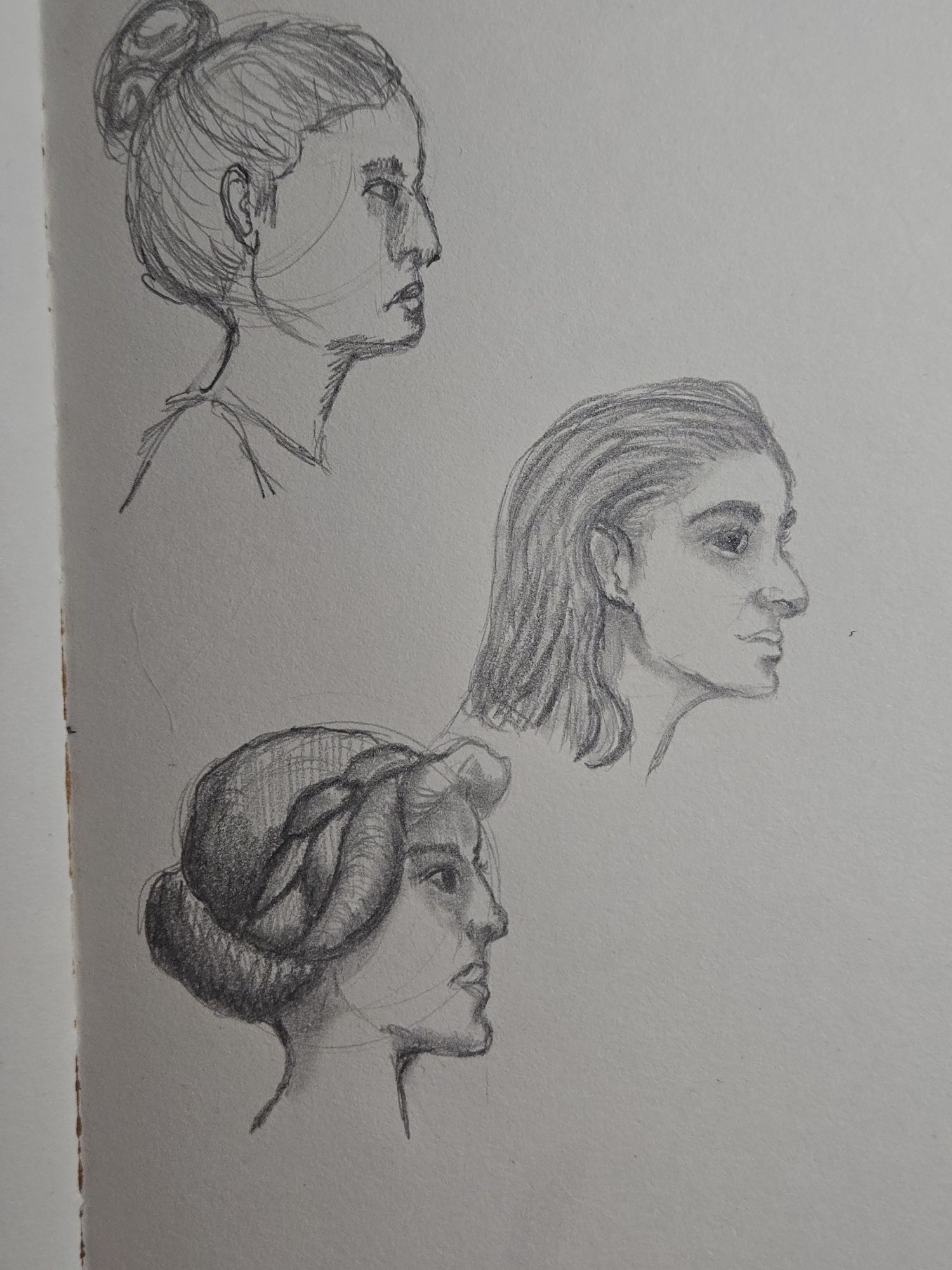
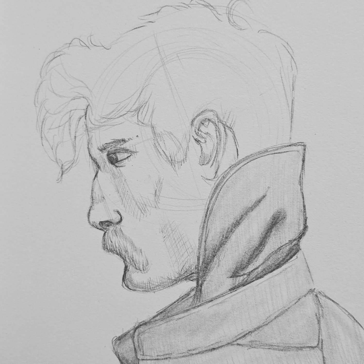
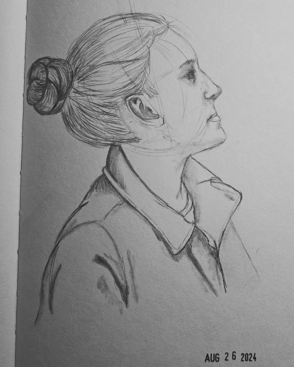
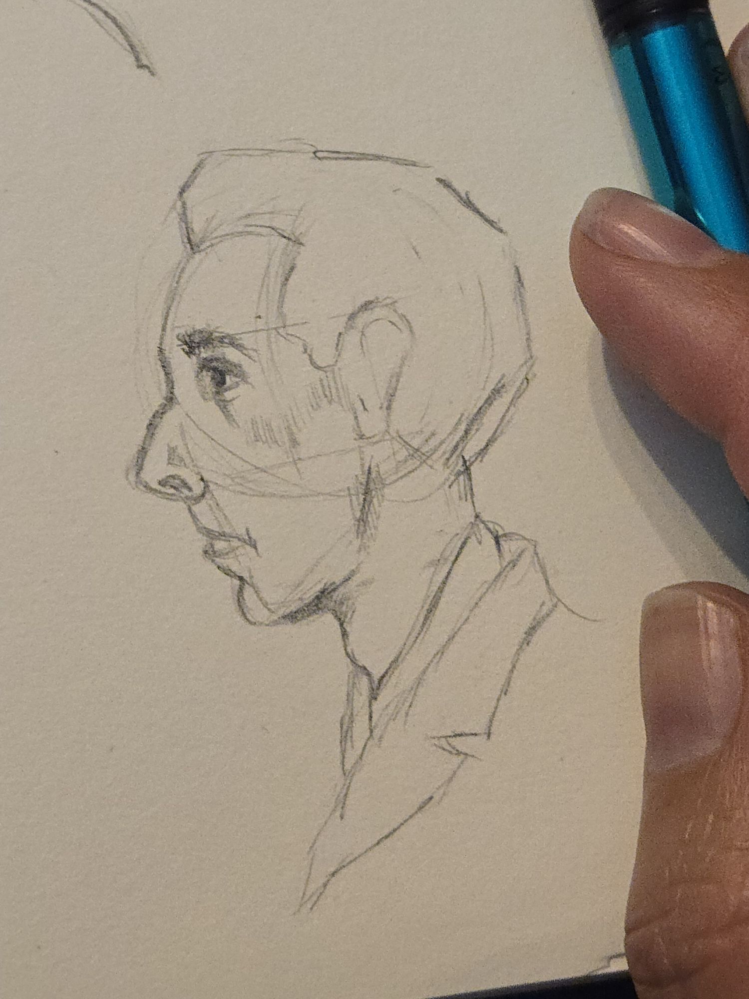
I spent time since my last post working on profile sketches. My side profiles have been, historically, pretty damn awful. I’m not saying that to be down and deprecating on myself – it’s just what any artist goes through. You suck at something until you practice and you stop sucking. I decided to dedicate some time to really kind of learning more on it – figuring out proportions better, trying to figure out why my faces all looked so flat, etc. And wouldn’t you know it, something just clicked and it made sense so much more. (I haven’t practiced since this, though, so I’m not sure that the breakthrough really stuck just yet.) Look at that progression! (And also, that first “meh” image isn’t even the worst I have drawn – so while they’re not great, they’re not laughable, either)
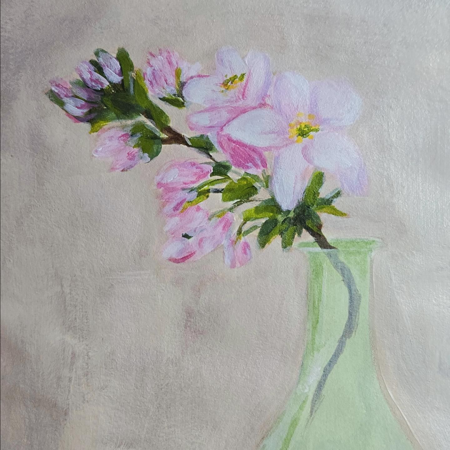
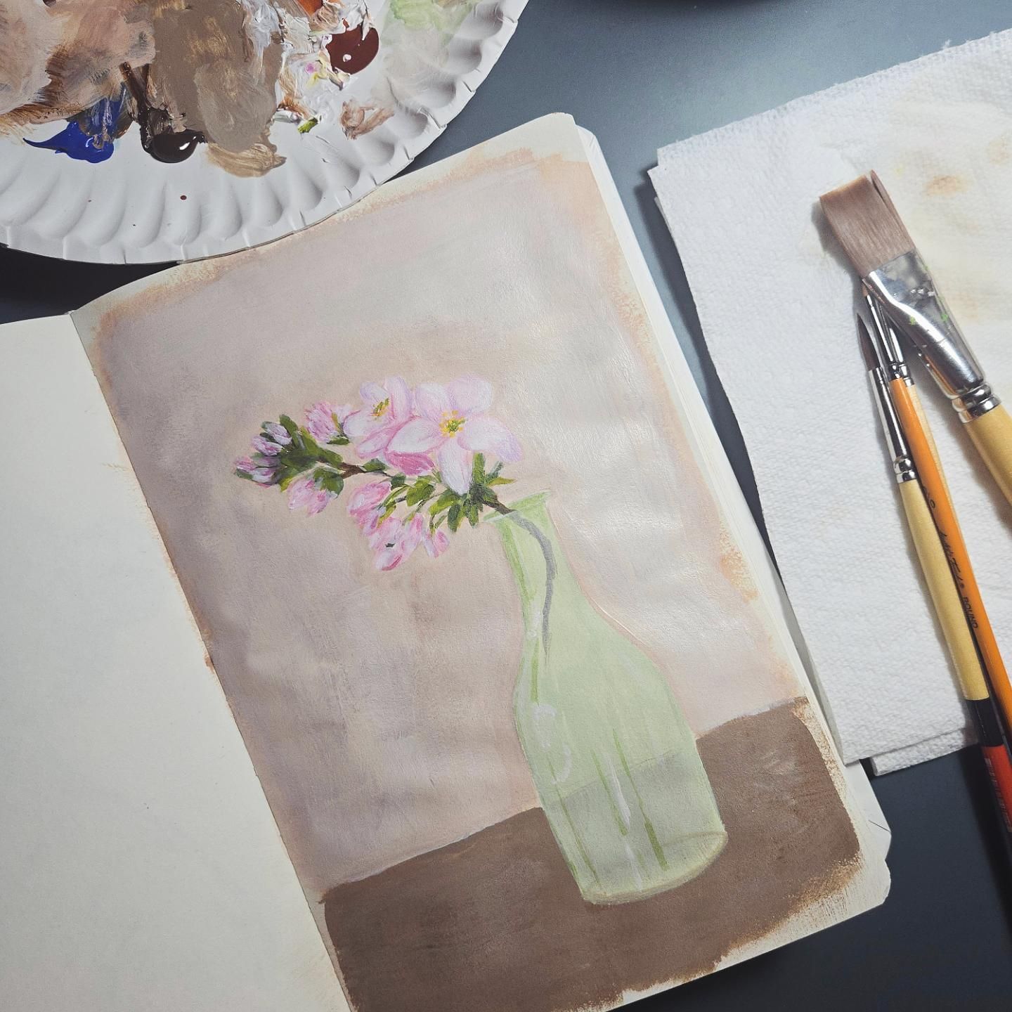
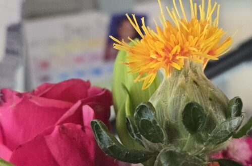
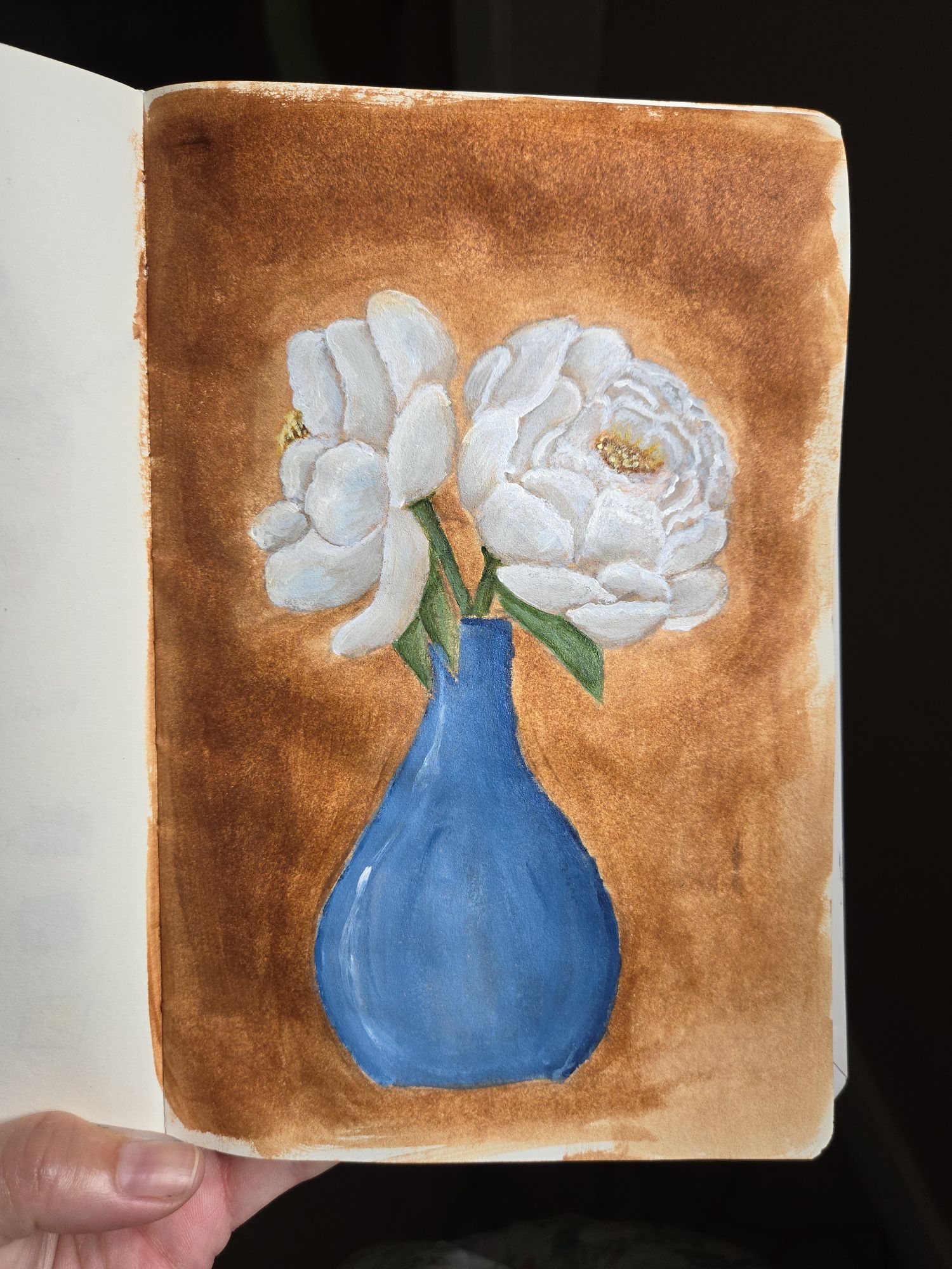
A few weeks ago we found a set of 11×14 canvases for cheap at TJMaxx and I excitedly brought them home, thinking that I’d put my acrylic paints to good use and make some art. And wouldn’t you know it, I unwrapped one of them and let it sit for a week or so. Then, earlier this week, I decided to go ahead and do a wash of burnt sienna on it, that way it was ready to go when I was. And then? Then I couldn’t think of anything that I wanted to paint. Or, rather, anything that I thought would be worthy enough of painting on a proper canvas. Which is so silly, right? Like, how am I going to learn and grow if I’m not willing to make mistakes with things? Especially when they’re cheap canvases, not some precious or rare thing that I may ruin forever.
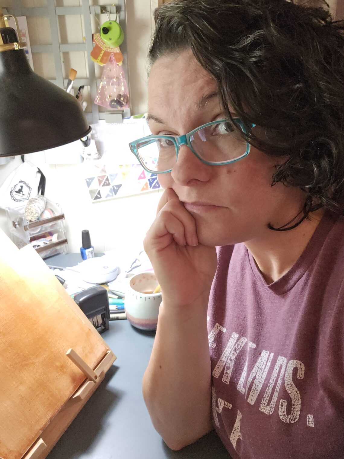
Anyway, I finally came up with something to paint, but ended up doing it in my sketchbook and not on the canvas. Which was, perhaps, a little stupid when I had a prepped and ready canvas RIGHT THERE… but also I’m somewhat thankful that I did it this way because a. I used less paint overall and b. I didn’t love how I did the background color on this one and this gives me some things to ponder before I attempt a larger version. My background color felt too dark, initially, and like the values just weren’t there to make the flowers “pop” as the central focus, so I went in to try to lighten and soften it and it feels like I just made it worse.
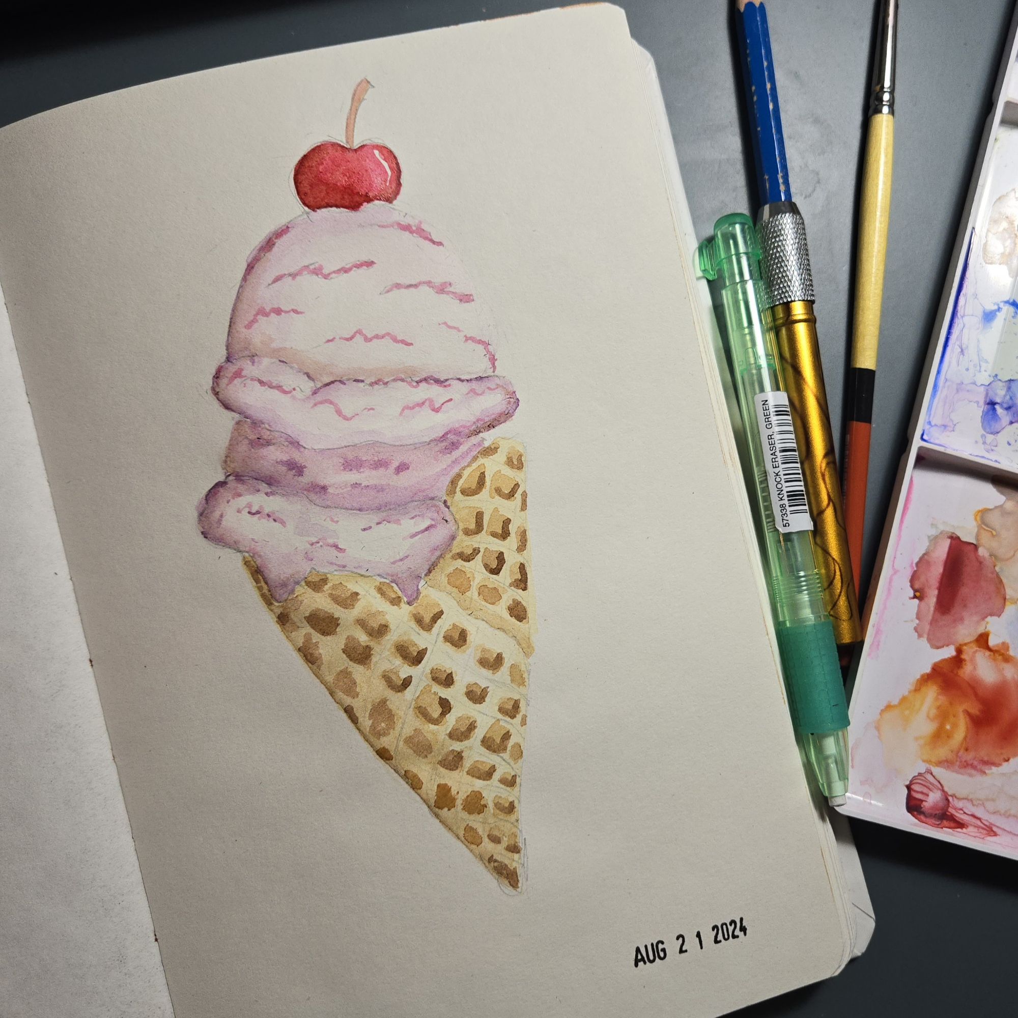
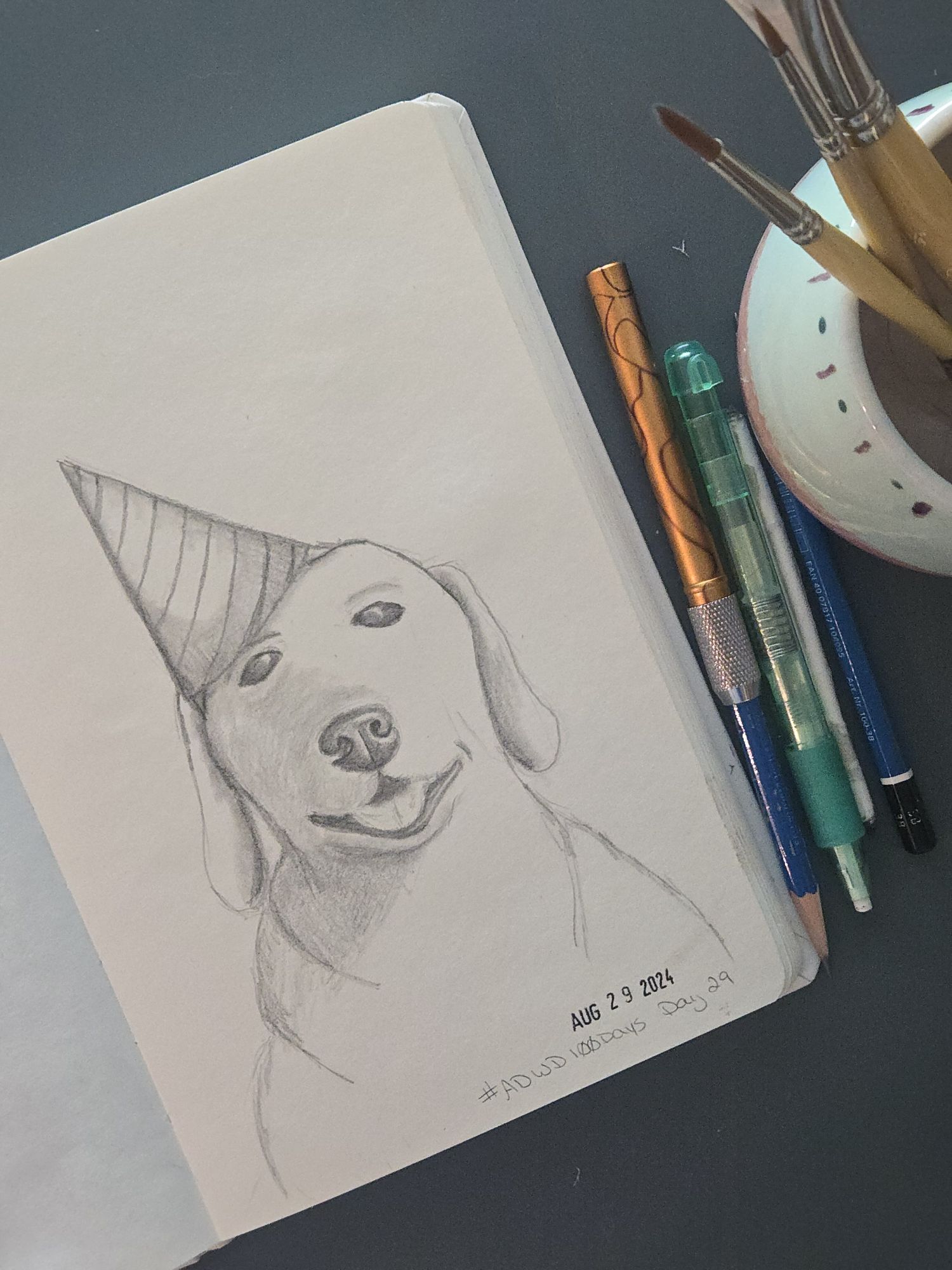
On the “things I bought but didn’t really need” front, I ordered myself a date stamp to use in my sketchbooks. I tend to nearly always date my sketchbook pages so that years down the road, when I look back thru them, I can see the timeline of my progress more accurately. But there’s something aesthetically pleasing to me about an old-school date stamp instead of my sloppy handwriting.
I actually kind of want to design my own signature stamp, too, so that at least my little doodles have something that identifies as mine rather than my scribble writing. I have some Speedball block printing stuff somewhere in the craft room, so I might dig that out and carve one up…… once I can settle on a design, even, for it.

You May Also Like

Birbfest 2025, so far
I never tire of these start-spun-plied snapshots